


brand guidelines
[rank_math_breadcrumb]
In today’s world, leading global brands seek to create interactive relationships with their customers and audiences. Pars Eshen Industrial Group is no exception. As a customer or audience member of the Pars Eshen brand, if you seek greater engagement with us, the Pars Eshen Brand Guide will help you understand how our strategies and approaches are reflected visually and in writing. Our visual and written brand documents will demonstrate how we, as a leading brand, present ourselves to our customers. Join us on this journey.
Our logo is the most visible element of our identity, a global signature in all Pars Eshen communications. It guarantees the quality that unites our diverse products and services. We use this version in print, on screens, and on our buildings.
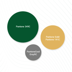
A company’s color palette is one of the most important tools for creating consistency across all touchpoints. These colors should dominate all visual communications of the organization.
A Seed Was Planted…
Amidst rocks and hardships, it found its way, grew to bless, and provided shade for support. Like a strong tree, proudly and firmly rooted in the ground, its branches reach towards the sky of tomorrow.

